A further look
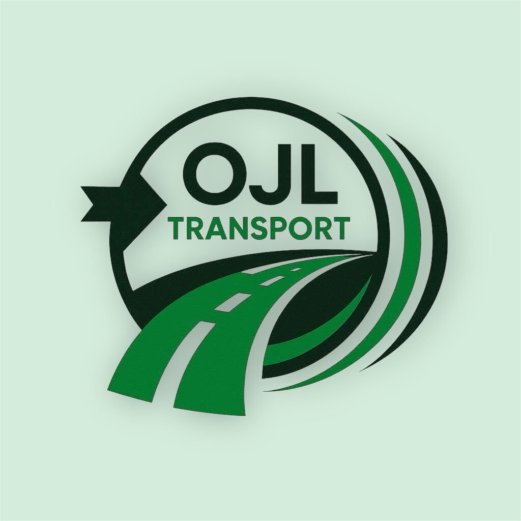
A Fresh Identity on the Move
At FennField, we designed the OJL Transport logo to embody movement, reliability, and progress. The sweeping road motif reflects the company’s journey-focused nature, symbolising motion and direction, while the bold, modern typography reinforces strength and trust. The combination of deep green and black tones evokes professionalism and sustainability, aligning with OJL Transport’s commitment to dependable service and forward-thinking values. This logo captures not just where the company is headed, but the smooth, efficient route it takes to get there.
The colour palette for the logo was designed to reflect movement, reliability, and professionalism. The deep forest green conveys strength and trust — essential traits for a transport company — while the bright, vibrant green introduces energy and progress, symbolising motion and growth. These two tones balance each other perfectly, representing both the stability of the brand and its forward-thinking nature.
Complementing these are softer greens and muted sage tones that add harmony and depth to the design. Together, the shades create a visual journey that mirrors the company’s purpose: connection, direction, and dependability. The palette feels natural yet bold — a strong visual foundation that communicates OJL Transport’s confidence and commitment to excellence on the road.
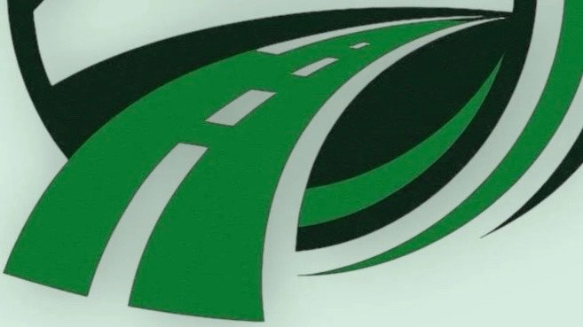
From a design standpoint, the road graphic serves as the visual anchor of the OJL Transport logo, creating a powerful sense of motion through curvature, perspective, and contrast. The sweeping path draws the eye forward, establishing depth and direction within a flat composition — a technique often used to evoke progression and momentum in transport branding. Its widening base adds dimensional weight, grounding the logo while guiding focus towards the company name. The use of negative space between the lanes is deliberate, maintaining clarity and balance without overcomplicating the form.
The layered arcs that surround the road operate as both framing devices and motion indicators. They echo the curvature of the path, creating rhythm and visual continuity while subtly reinforcing the brand’s forward energy. Each layer was given a distinct shade of green to introduce visual hierarchy, suggesting depth and speed through tonal variation rather than gradients. This approach gives the logo a modern, clean aesthetic that remains versatile across print and digital media. Altogether, the composition feels engineered — structured for strength, but fluid enough to embody motion, aligning perfectly with the essence of OJL Transport’s identity.
Every element of this logo was crafted with intent — a seamless blend of motion, structure, and identity that reflects OJL Transport’s journey and FennField’s commitment to timeless, strategic design.